

Introduction to Design Systems
Design systems are everywhere these days. It seems like every leading technology organization has published a design system, including Salesforce , Shopify , Airbnb , Spotify , Google e Microsoft .Design systems are even generating their own specialized user experience functions and products.
So how did all this happen? Why are design systems suddenly so popular? And what do all those terms like UI kit, design language, and style guides really mean? We've put together this comprehensive series of blog posts to take a deep dive into... design systems .Based on internal Adobe research, interviews with 15 experts from organizations like Google, Shopify, Slack, and more, and a survey of 12 designers working in design systems, here is our basic guide.
A brief history of design systems
Although design systems are enjoying a moment in the sun and seemingly everyone is launching and developing their own, they are not, in fact, a new idea. Andrew Couldwell , a designer who wrote a book about design systems , He says that “design systems aren’t really anything new. I’ve been working with them for almost a decade. They’re really an evolution of brand guidelines in some respects.”. Shawn Cheris , Adobe's director of experience design agrees. "Adobe has so many products, and the brand team has always had to work to find ways, from a visual architecture standpoint, to make things look like they come from one company.".
Returning even further to the built environment, Christopher Alexander began discussing design patterns in the 1970s with the publication of his book. A Pattern Language: Towns, Buildings, Construction in 1977. His ideas about reusable design pieces in architecture have influenced the practice for several decades. In the 70s and 80s, brand guidelines, such as those of NASA or from New York City Transit Authority, They outlined how the visual identity should be expressed, and are coveted collector's items today.
In the digital age, brand guidelines and visual identity have continued to inform the online presence of websites and brands. With the proliferation of digital channels, such as mobile apps, marketing websites, web applications, and even voice applications, organizations have realized the need for a cohesive customer experience.
Why design systems and why now?
Now, in today's digital context, we find ourselves at a point where UX and digital product design are in the spotlight. Most organizations have recognized the importance of digital as a way to differentiate themselves, or at least keep up with their competitors. Enterprise organizations often have multiple digital product design teams working across different product lines and platforms. For example, in terms of consumer-facing products, Airbnb maintains a web presence, an iOS app, and an Android app. In addition, there are also internal, non-publicly-facing applications to consider.
Furthermore, this proliferation of digital properties and products across platforms means that the velocity of content has increased dramatically. “The challenge of the velocity of content is that designers need to do more than ever before. As a designer, everything I do needs to scale – across screens, platforms, and people. All of this means that being a designer today is both exciting and daunting,” he says. Cisco Guzman , director of product management at Adobe XD .
Design systems are a logical move for organizations that find themselves creating products across the web, multiple platforms, and formats. They are the natural outcome of design teams trying to coordinate while recognizing the potential to reduce duplication of work. Design systems are also crucial when it comes to driving brand consistency and product experience.
What does a design system consist of?
While there is no "one-size-fits-all" approach to design systems, there are generally three main items that many design systems include:
- Centralized access point. Often, a design system will have a website or internal or public folder (such as a Dropbox or Google Drive folder) that serves as a centralized resource. It contains system documentation and information on design principles, guides on topics like content, design, and accessibility, and links to reusable design and development resources.
- Reusable design features. UI Kits, for example, are an Adobe XD file of UI elements/symbols that are kept up-to-date. In Adobe XD, this is... a sheet of stickers centered and can be used when starting a new set of screen designs.
- Reusable development resources. A central GIT repository of code-based components that developers can use. They can be in various frameworks, for example, iOS components, React components, HTML/CSS components, etc. They are seen as an "expression" of the design system.
Why are organizations investing in design systems?
Within design teams and organizations, the case for creating design systems is compelling. It's important to remember that design systems are not an end in themselves; they are a means to an end and a way to achieve certain results. Different organizations will have different priorities, but based on our research, there are some common driving forces behind investing in design systems.
A very popular case for design systems is that of consistency. The desire to have a cohesive brand and experience across multiple products from the same company is realized through a shared design system that can be implemented and used by various teams. Often, the need for consistency is determined by an interface or UI audit that shows the very different UI styles that exist in a brand's product, for example, all the variations in button styles.
Efficiency is another favorite reason for creating a design system.Reusable and repeatable components and patterns allow design and development teams to accelerate their workflows. They also reduce duplication of effort, as interface elements don't need to be recreated from scratch every time. With the popularity of design sprint approaches, reusable UI component libraries also enable rapid prototyping.
Design systems can also allow a smoother collaboration Within an organization, with a defined vision for the look, feel, and experience of digital products, teams have a better understanding of "what looks good" and can aim to meet an agreed-upon threshold that was collaboratively defined. Contributing back to the design system also allows people to be part of the evolution of their organization's system. In this way, design systems can act as a Trojan horse for shared vision and breaking down silos.
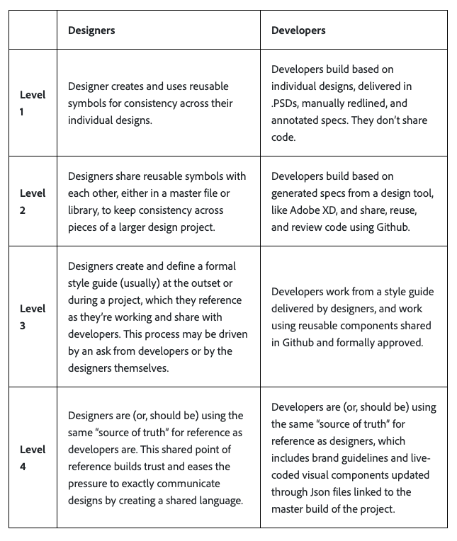
The four stages of maturity of the design system.
When attempting to create a design system to address some of these desired outcomes, teams may go through several stages or levels to arrive at a robust design system. Our internal research with Adobe customers and clients has revealed four levels of systematic design and development. These levels are linked to the maturity of a design system approach:
A glossary of design system terms
At each of the above levels of project and development systematically, there are various elements and components of a design system that a team may be using. The field of design is notorious for debating semantics. With the term "design systems" gaining popularity in recent years, people may be referring to a few different things. There are also debates about what makes a true design system.
The goal of this glossary is not to produce rigid definitions, but rather to demystify some of the terms you will encounter when speaking and reading about design systems. Let's analyze some terminology you may hear:
- Design system It's an umbrella term for a library of experience design and development resources that is shared by an organization and its teams. It typically consists of multiple parts.
- The components These are the interface and UI elements that make up a digital product, for example, buttons, form fields, radio buttons, and checkboxes.
- Pattern library This refers to a set of 'design patterns' for the user interface that are composed of components of design system elements. These patterns can, for example, show a common UX module, such as a payment information form.
- Brand guidelines These are guidelines that generally belong to the brand or marketing team and cover the use of the company logo, typographic guidelines, and color palette. These design systems predate current ones and can be an important starting point for design systems teams.
- Style guides These are similar to brand guidelines and may refer to a visual style guide and/or an editorial guideline covering writing style and tone of voice.
- The UI Kit This generally refers to a file or document of user interface elements, such as buttons, form fields, checkboxes, and radio buttons, that are in a format like an Adobe XD sticker sheet. They are used by design teams to create screen mockups and prototypes.
- Tokens These are the most basic style elements of a design system – for example, specified brand colors. They are managed through a centralized file, such as a JSON file, which acts as a single source of truth for design system styles.
Everything old is new again.
Design systems are nothing new and represent the digital evolution of the desire to use brand standards and design patterns to create products more quickly and consistently. For large organizations, they are a natural evolution of the tools that design and development teams use to ship products.
One of the most important things to understand is that "design system" is a broad term that can encompass many aspects and features. Having clarity on the language and which aspects will be most meaningful to your team and organization will help in any effort to systematize design and development.


