
10 Usability Heuristics and How to Apply Them to Product Design
The 10 Heuristics for User Interface Design Heuristics were created by Jakob Nielsen in 1994. Although introduced more than two decades ago, they are still relevant to modern product design.
No. 1: Visibility of system status
The system should always keep users informed about what is happening, through appropriate feedback within a reasonable timeframe.
What it means: Don't leave users wondering; offer any type of feedback (visual, audio, tactile) to help them understand what's happening. It's particularly important to provide feedback on user-initiated actions – in this case, the feedback acts as acknowledgment for the user (i.e., users understand that the system has received their request).
Example: Loading. Loading times can vary drastically depending on the context, and when users receive no feedback, they simply have no information as to whether the system is doing anything or not. Feedback alleviates fears that the system is not responding.


System feedback isn't necessarily visual; it can be audio. Some products integrate sounds so naturally into their products that the sounds become part of their brand. For example, many of us are familiar with the Apple Mac startup sound.
# 2: Combination between the system and the real world
The system should speak the users' language, using words, phrases, and concepts familiar to the user, rather than system-oriented terminology.
What it means: It's essential to identify all areas of your app that could cause confusion and redesign them to make them clear to your target audience. Confusion can be caused by unfamiliar terms or concepts. To overcome the first problem, we need to avoid jargon and use terms familiar to your target audience. To overcome the second problem, we need to rely on real-world analogies.
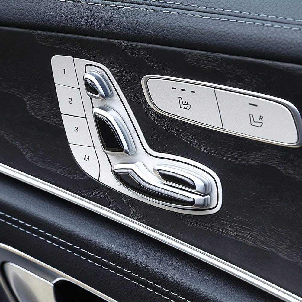
Example: analogy with the real world. Mercedes uses the metaphor of a physical chair for the electric seat adjustment controls. This helps passengers understand how to configure the seat according to their needs.
No. 3: User control and freedom
Users often select system functions by mistake and will need a clearly marked "emergency exit" to leave the unwanted state without having to go through a lengthy dialogue.
What it means: Support for undo and redo for user operations.
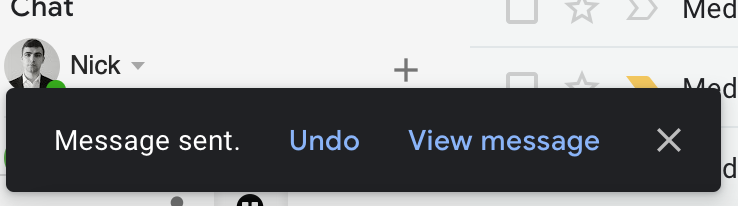
Example: Undo action. When users send a message using Gmail, the service offers a confirmation dialog box with an Undo button. The Undo button allows users to cancel sending if the message was sent accidentally.
# 4: Consistency and standards
Users should not have to wonder whether different words, situations, or actions mean the same thing.
What it means: try – Focus on consistent design. Offer both 'internal' consistency (consistency of individual design decisions within your application) and 'external' consistency (consistency with platform standards).
Example: Product navigation. The placement of crucial navigation objects must be consistent. The structure and location of the navigation menu should be the same in different parts of your application/website.

# 5: Error Prevention
Even better than good error messages is a thoughtful design that prevents a problem from occurring. Eliminate error-prone conditions or check for them and present users with a confirmation option before they commit to the action.
What it means: Design your products to minimize the total number of instances in which users may encounter problems and require support and assistance.
Example: Form entry. Built-in form validation can be used to validate data in real time, so the user doesn't need to tap the Submit button. This technique is especially excellent for passwords because it can tell users what they need to change and why.

# 6: Recognition instead of remembering
Minimize the user's memory load by making objects, actions, and options visible. The user should not have to remember information from one part of the dialog to another. Instructions for using the system should be visible or easily retrievable when appropriate.
What it means: '‘ 'Don't make users think' (Steve Krug). Provide all the necessary suggestions at the moment users need them.
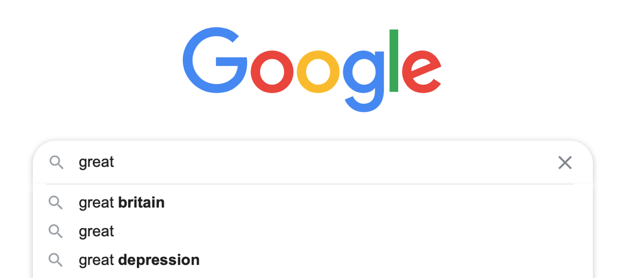
Example : contextual recommendations .Google Search's typing suggestion is an excellent example of contextual recommendations. As the user begins to type, Google Search suggests the relevant query, helping users find what they need in less time.
# 7: Flexibility and efficiency of use
Accelerators – unseen by the novice user – can often speed up the interaction of the experienced user, so that the system can cater to both inexperienced and experienced users.
What it means: Offer shortcuts that allow users to interact more efficiently with your product.
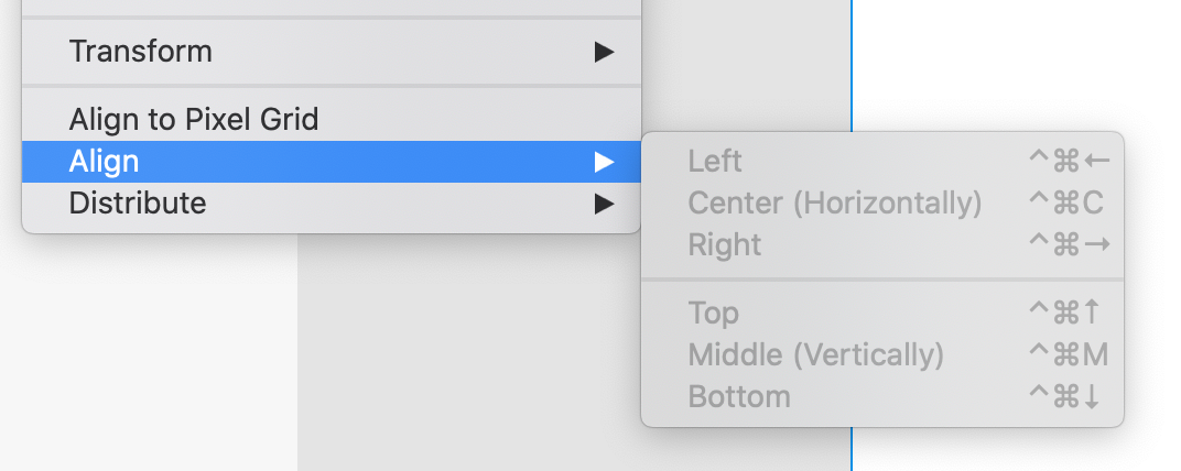
Example: Shortcuts .Adobe XD offers keyboard shortcuts that will allow you to perform frequently used actions without clicking through the menu.
# 8: Aesthetic and minimalist design
Each extra unit of information in a dialogue competes with the relevant units of information and diminishes their relative visibility.
What it means: Follow the 'less is more' approach in your design. Remove all unnecessary elements that don't have a positive impact on the user experience.
Example: Prioritize content over chroma key. .Minimalist products focus on content and remove all unnecessary visual design details. Apple's website is an excellent example of minimalism. Many pages on the site are centered on a particular product or idea, making it easier to prioritize information.

No. 9: Help users recognize, diagnose, and recover from errors.
Error messages should be expressed in plain language (without codes), accurately state the problem, and suggest a solution in a constructive manner.
What it means: Don't just state that users are facing a problem; offer a solution to resolve it.
Example: clarity and usefulness of error messages . When users see error messages like this
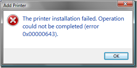
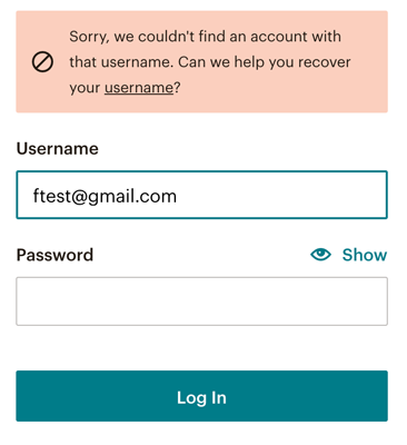
They rarely know what to do next. That's why it's vital to provide a clear path on how to solve the problem. Compare the message above with the following. It's evident which message works better for users.
# 10: Help and documentation
Even though it's best if the system can be used without documentation, it may be necessary to provide help and documentation. This information should be easy to search, focused on the user's task, list the concrete steps to be taken, and not be too lengthy.
What it means: Offer useful documentation within your product. The documentation should be part of the product design backlog; it should be a living document that will be updated regularly.
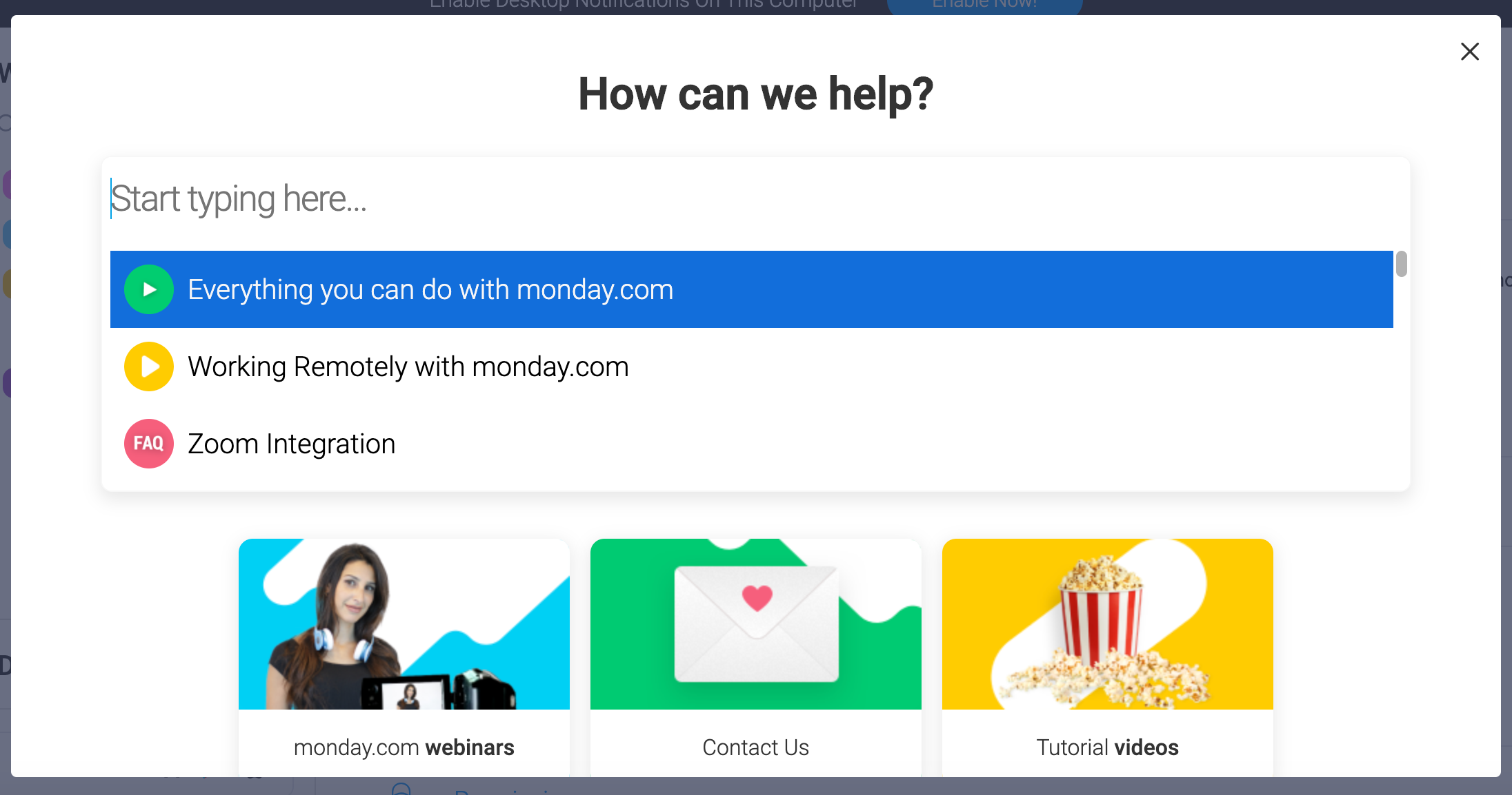
Example: Help and documentation are available in the app. Monday.com offers help and support directly within the product.
Learn how to design better products.
Interactions between computers and humans should be as intuitive as conversations between two humans. The Interaction Design Foundation It will help you learn how to design effectively and persuasively.
www.interaction-design.org
Originally published in uxpro.cc


