
6 principles of visual design
1. Gravity
Gravity applies to objects and shapes, even in visual communication. It might seem strange – it's not as if gravity is a real force pulling 2-D objects down, as it is in real life.
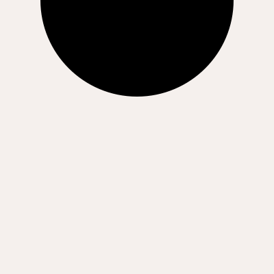
But gravity is so ingrained in our perception of reality that it even translates to 2-D objects on a page. See the image below as an example. It must be a little unsettling, as if you were expecting the circle at the top to fall off at any moment.
Now look at this image below – the reverse.
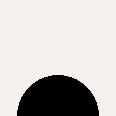
This composition should look less like a ball about to fall – and more like an object simply resting at the bottom of the page. Grounded. Peaceful.
Lesson? Be intentional and mindful when designing, as visually heavy objects on top can feel uncomfortable and anxious (unless, of course, that's the feeling you're trying to convey).
2. Reading direction
In Western society (reverse the opposite), we read from left to right, from top to bottom. Because of this,Objects on the left are perceived as entering, and objects on the right are perceived as exiting.
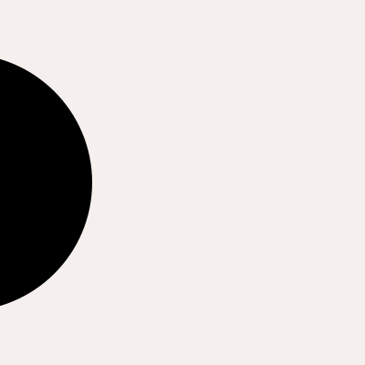
Here is a circle on the left. Again, because we read from left to right, the circle appears to be entering the composition. Below, the circle appears to be exiting.
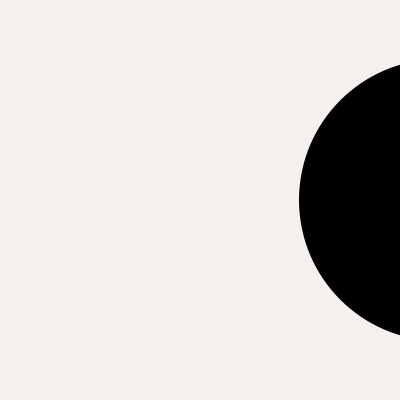
You can also use this to convey certain emotions. For example, want to make an object appear to be peeking? You can create a composition like the one below:
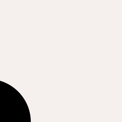
Or, conversely, do you want to convey an object (or character) running away?
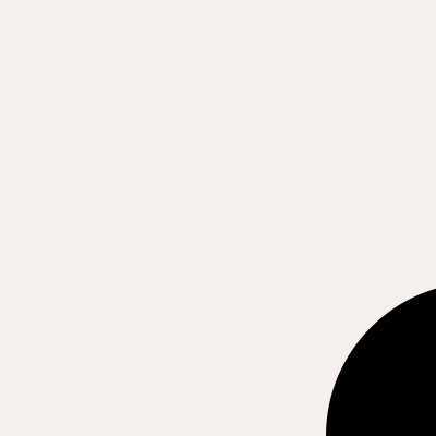
3. Reading priority
Since we read from left to right, top to bottom, we naturally see the objects in the upper left corner first, and then our eyes will naturally move to the lower right corner and see the things there afterward.
This is important because if you're trying to create a visual hierarchy (maybe you want your users to see the title first and then content Where you place things, even if they are the same shape/color/size, makes a difference.
See this example below:
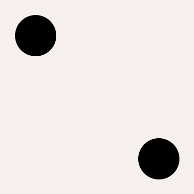
If you grew up reading English books from the top left corner to the bottom right corner, you would probably have looked at the top left circle first, before the bottom right corner.
4. Visual Strain
This was once described to me as physical tension that was translated and amplified. It's the feeling you get when you see a glass full of liquid on the edge of a table.
Often, visual tension is simply unintentional – designers don't realize they've accidentally placed shapes adjacent to each other, creating tension without knowing it. This can appear sloppy. Take a look at the image below:
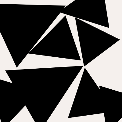
Still feeling uncomfortable? Here are all the highlighted stress points below.
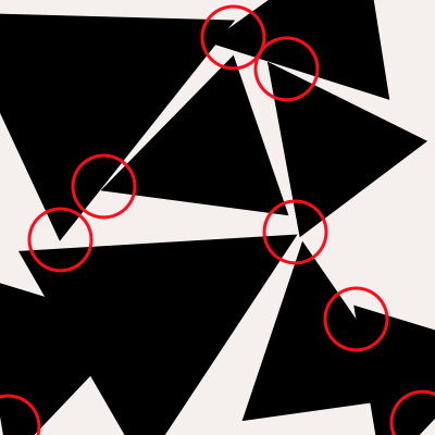
You can, if intentionally, use visual tension to grab the user's attention and create a sense of anticipation. Perhaps you're designing a poster for a protest or want to draw someone's attention to something. In these cases, make sure your tension is intentional and doesn't look like a mistake.
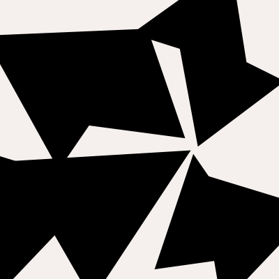
Here is the same composition with the tension focused and intentional on a specific location.
5. Dynamic vs. Static
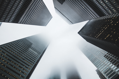
Static compositions can often seem boring. An easy way to spice it up and make it more exciting is simply to tilt the horizon. Here's an example of a static image that looks outdated.

Now tilt your gaze, and suddenly the cityscape seems much more exciting.

To make the composition even more dynamic and exciting, you can wrap around the edges and let the shapes escape from them. Check out this 3-point perspective composition:
6. Activating Negative Space
You can use directional shapes to activate negative space – to a point. Too little directional force and the negative space remains inactive. Here's a shape that catches your attention and then moves your eyes up and to the right.
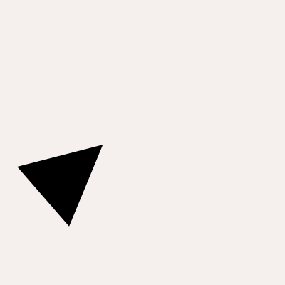
The problem is that your attention is probably already dead by the time you reach the top right corner of the page. Your eye moves past the object, but there's simply too much space there and too little directional force from the object for your eye to fall. The space remains inactive. However, with a little cropping/scaling:
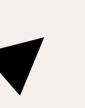
Suddenly, the space around the shape seems intentional and active. Take it away? If you're trying to move someone's eyes, be aware of inactive negative space. An easy trick is to simply point at the object with your finger, move in the direction their eyes naturally move, and observe where their attention naturally drifts. If this happens much sooner than you'd like, you'll need to adjust your layout—whether the shape or the edges—to keep the negative space active.


