Text fields and form design – UI components series
Simple rules that will help you create forms that users will want to fill out.
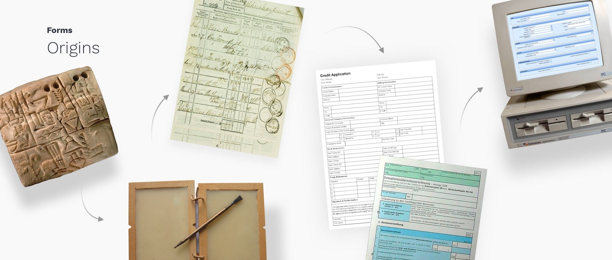
Organizations have been around for a significant period of time, greatly simplifying the task of drafting complaints and various other legal claims. With the advancement of information and its processing, the means of collecting data are also evolving. Since printed forms have been around for years, we can learn some lessons from their design.
Anatomy of the text field
Text fields allow users to enter text into a user interface. They typically appear in forms and dialog boxes. The design of the text field component should provide clear availability for interaction, making the fields discoverable in layouts, efficient to fill, and accessible.
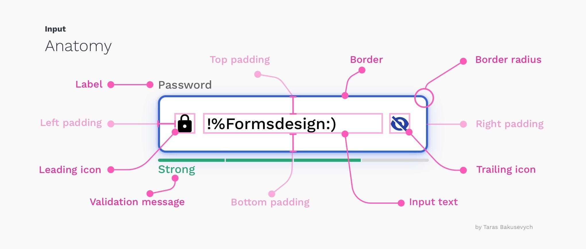
Here are the main elements of the Basic Text field:
1 .Container – interactive entrance area
2. Input text – inserted in the text field
3. Label text – informs users what information belongs in a given form field.
4. Placeholder text – is a description or example of the required information that is replaced by the input text after users provide it.
5. Auxiliary or validation text (optional) – provides additional context or a validation message
6. Home icon (optional) – describes the type of input that a text field requires
7. Icon on the right (optional) – additional control for the entered text, such as clear, hide/show, etc.
Types of text fields
Most of them are based on basic text fields that have been modified to better handle specific types of information, such as credit card numbers. Here are just a few examples of the most commonly used input types across all the UIs we've created:
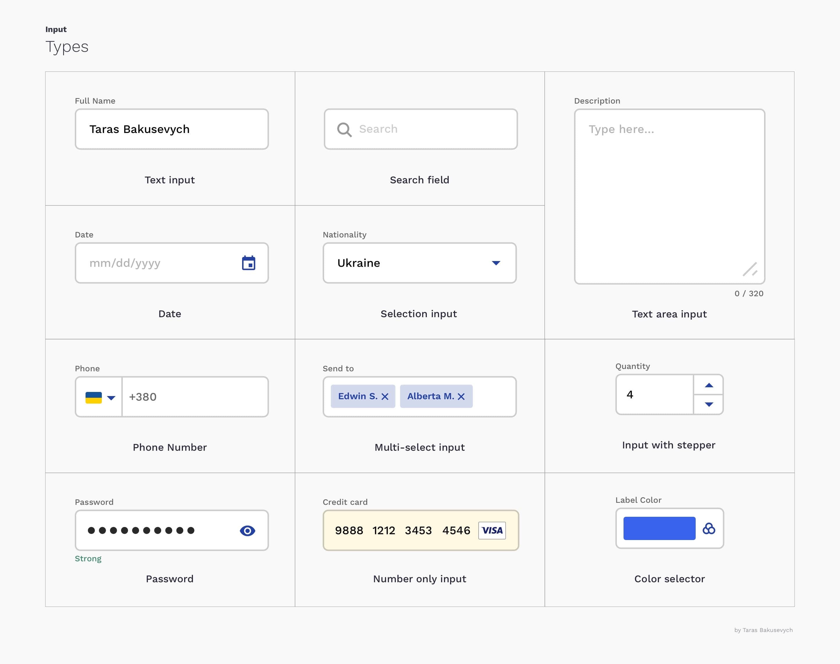
( We're not specifically talking about certain input types, such as checkboxes and radio buttons, as we'll cover those later in the series. )
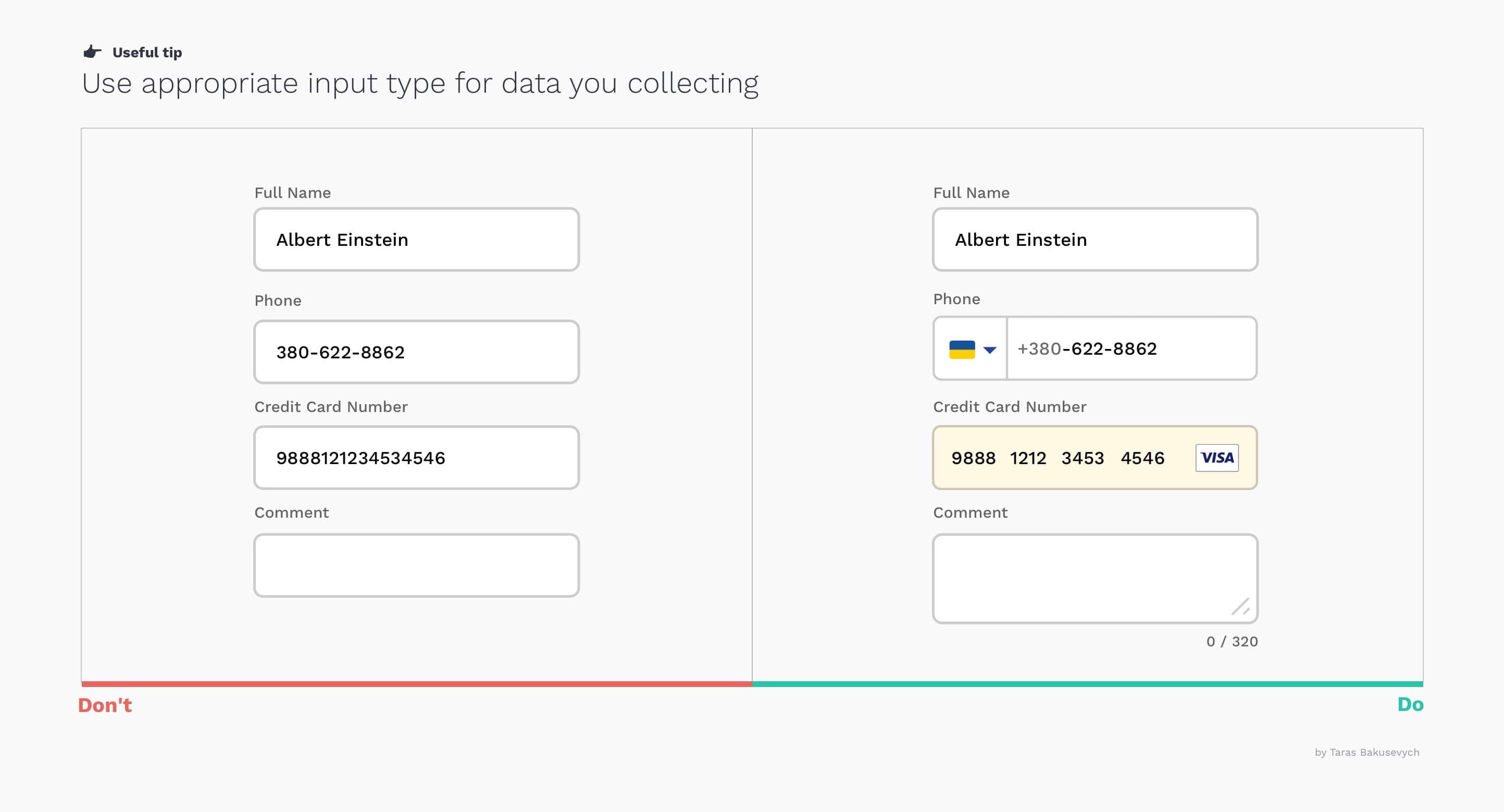
Use the appropriate input type for the data you are collecting.
Providing the correct text field type for the requested data will help users enter information in the correct format and avoid errors, making the process as easy and efficient as possible.
Text fields need to change their appearance based on state and user interactions.
This can be done by providing visual cues that communicate the state of the text field. Input text fields can have one of the following states: inactive, hover, disabled, focused, validation, error. All states should be clearly differentiated from each other and consistent throughout the form and application. It is best to follow best practices so as not to challenge the user's mental models.

Choosing the best text field style
Generally, you have three main options for label placement: left-aligned, top-aligned, and right-aligned. The best style for you will depend on the main objectives and sizes of the form, the component library, and the platform you designed for. They all have some advantages and disadvantages.
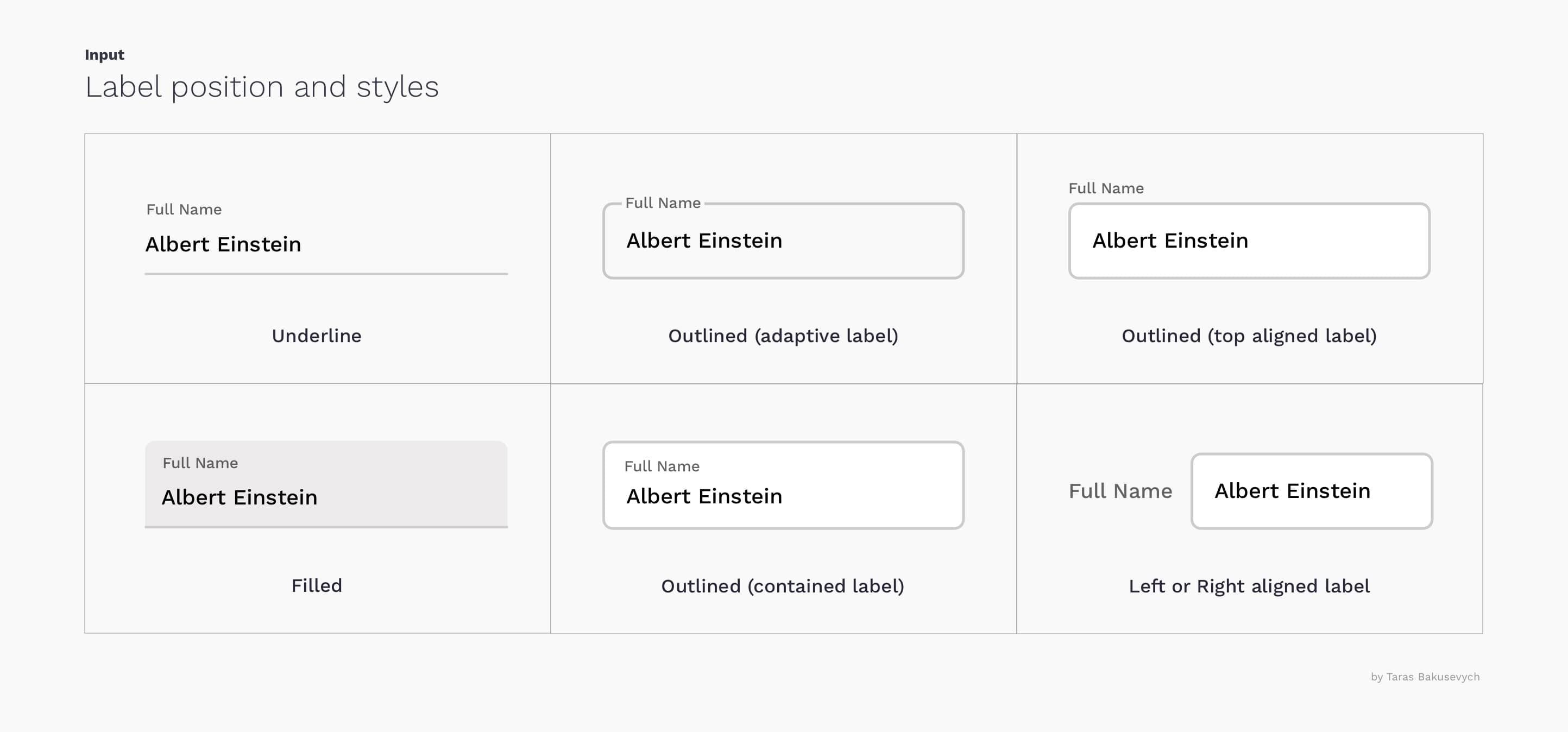
The underlined entry popularized with the original material design guidelines is not the best option. These have already been revised based on the large... Study of the Evolution of Material Design I recommend you check that out. Interestingly, the same study showed that users prefer inputs with rounded corners.
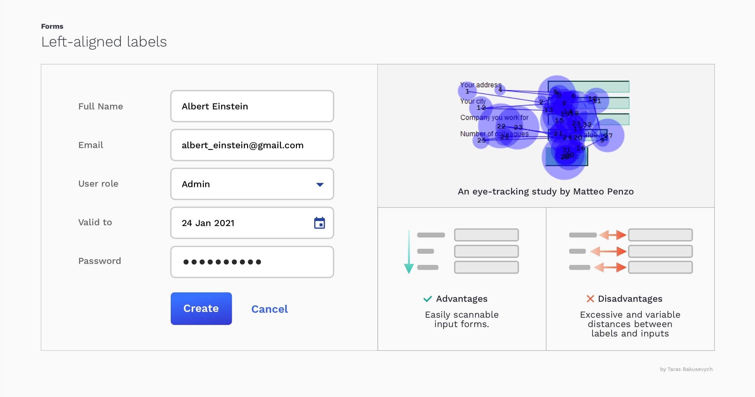
Left-aligned labels
A good option when the requested data is unfamiliar to users.
- Advantages: Easily scalable labels, good use of vertical space.
- Disadvantages: Excessive and variable distances between labels and corresponding entries increase completion time.
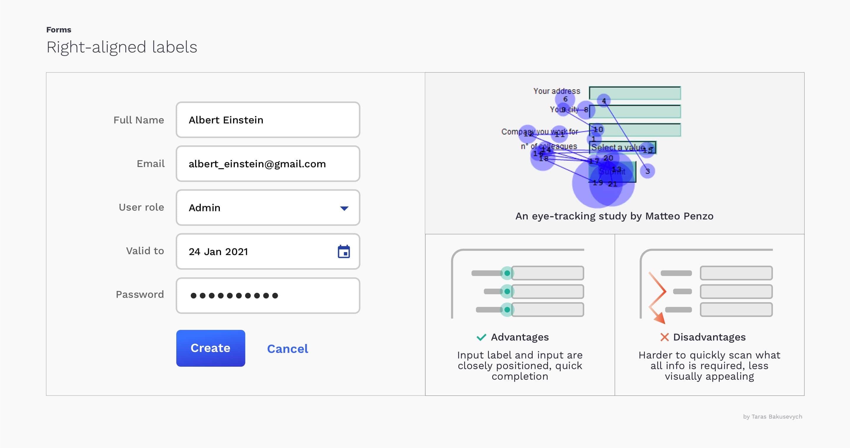
Right-aligned labels
Achieve a completion time that is almost twice as fast compared to left-aligned labels.
- Advantages: The labels and text field labels are well positioned, limiting the number of eye movements, resulting in a quick completion time.
- Disadvantages: It's more difficult to quickly scan the form and understand what information is required.
More aligned labels
Faster completion time and best overall choice for most cases. Works well on mobile devices as it doesn't require much horizontal space.
- Advantages: Allows users to capture input labels and input text with a single eye movement, resulting in faster completion time.
- Disadvantages: It requires more vertical space.
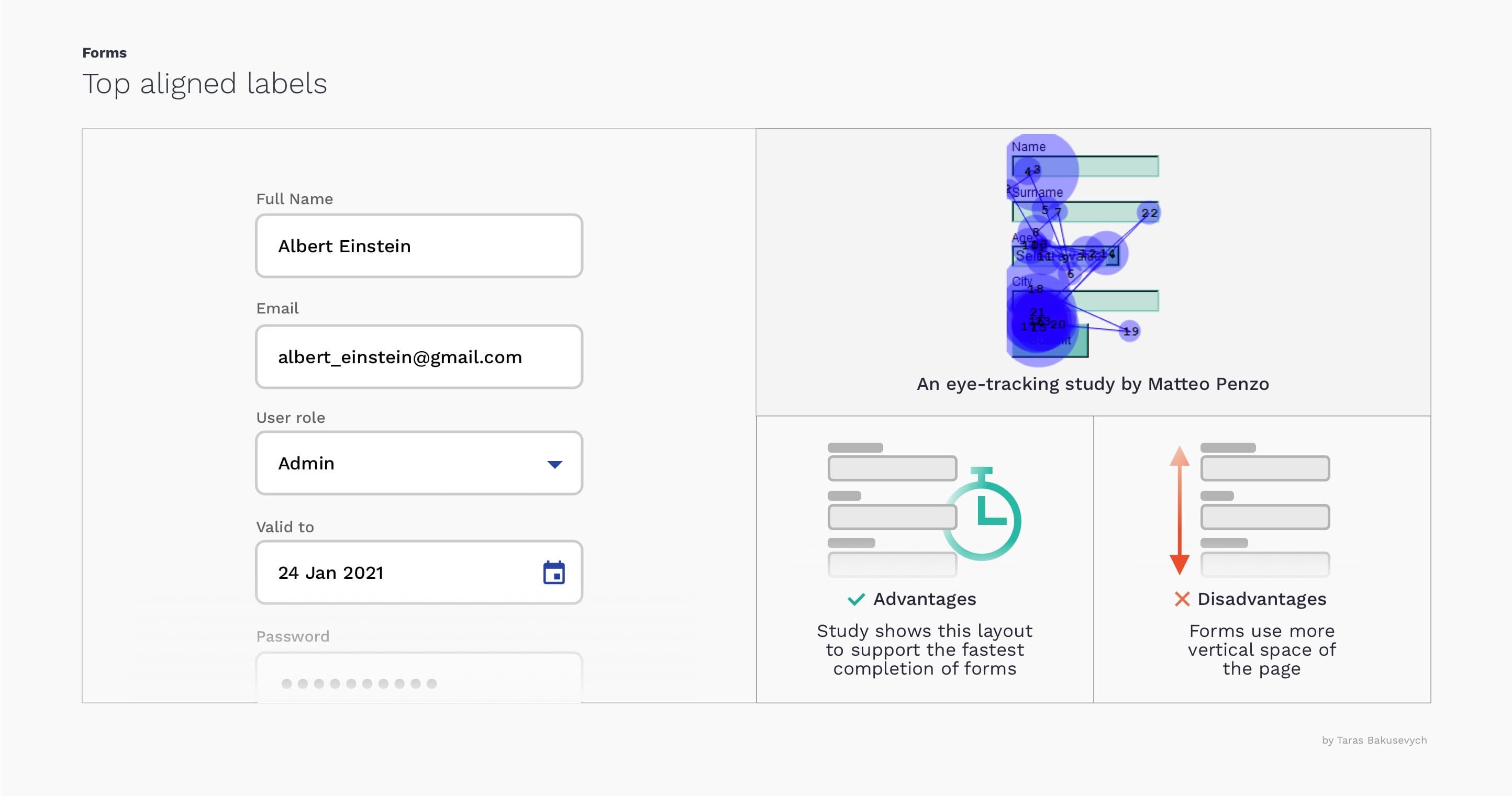
You can learn more about this topic. “Best practices for form design – by Luke Wroblewski” e “"Placement of labels on forms – by Mateo Penzo"”
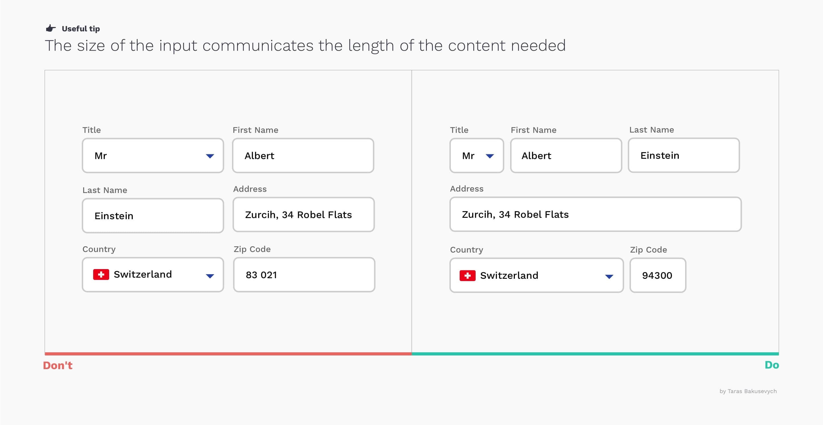
The length of the text field should be proportional to the expected user input.
Using identical input lengths for all text fields in your forms will make them visually appealing, but will make them more difficult to complete.
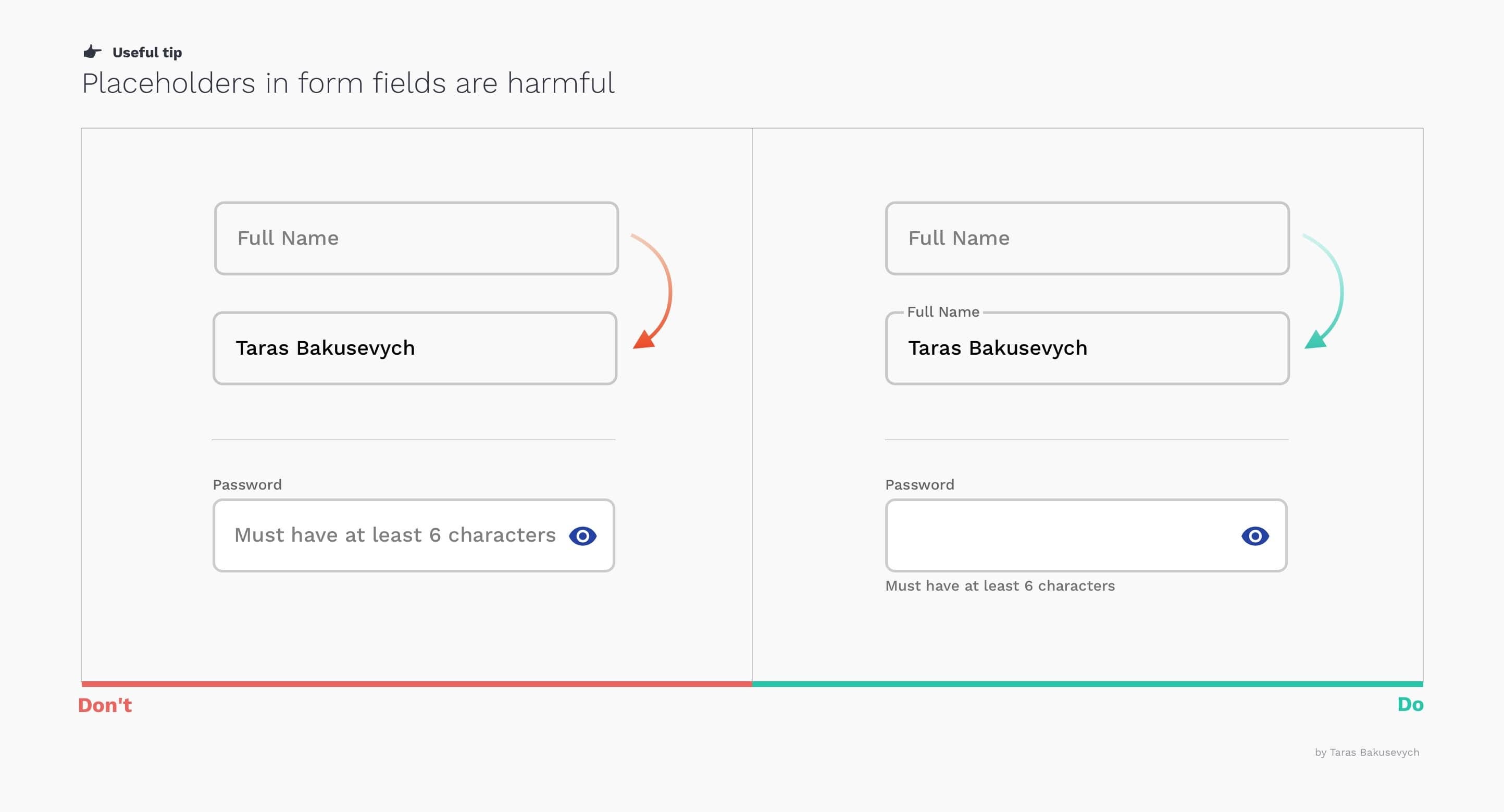
Placeholders do not replace labels. Placeholder text disappears, overloading users' short-term memory. Without labels, users cannot verify all the information provided before submitting a form. If you want a very minimalist form design, you can use the floating labels approach of Material Design.
Sometimes, the placeholder text in the form can confuse users; it's better to use hint text outside the field.
Help users fill out forms.
- Help resolve incomplete queries by completing the form. automatic. This happens in the input box where you type, and you can press Enter or the "right arrow key" to accept it.
- Search a virtually unlimited list of keywords and phrases related to Auto-Suggest. This list appears as a list of multiple suggestions in the form of a drop-down menu.
- Pre-fill the fields and use smart templates. Often, you can easily detect a user's country and city via IP address or geolocation. And based on the most common scenarios and analyses, you can define what should be selected by default. E-commerce is an exception; do not select any purchase-related preferences, such as size or color.
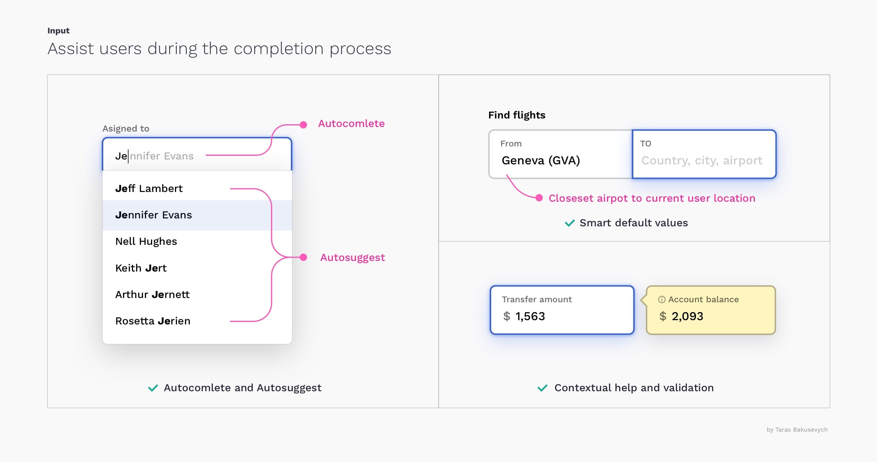
- Provide contextual information. If you know that, in order to make the right decision or avoid mistakes, users will need some additional information, such as an account balance when making a transfer, don't hesitate to provide it.
Use inline validation
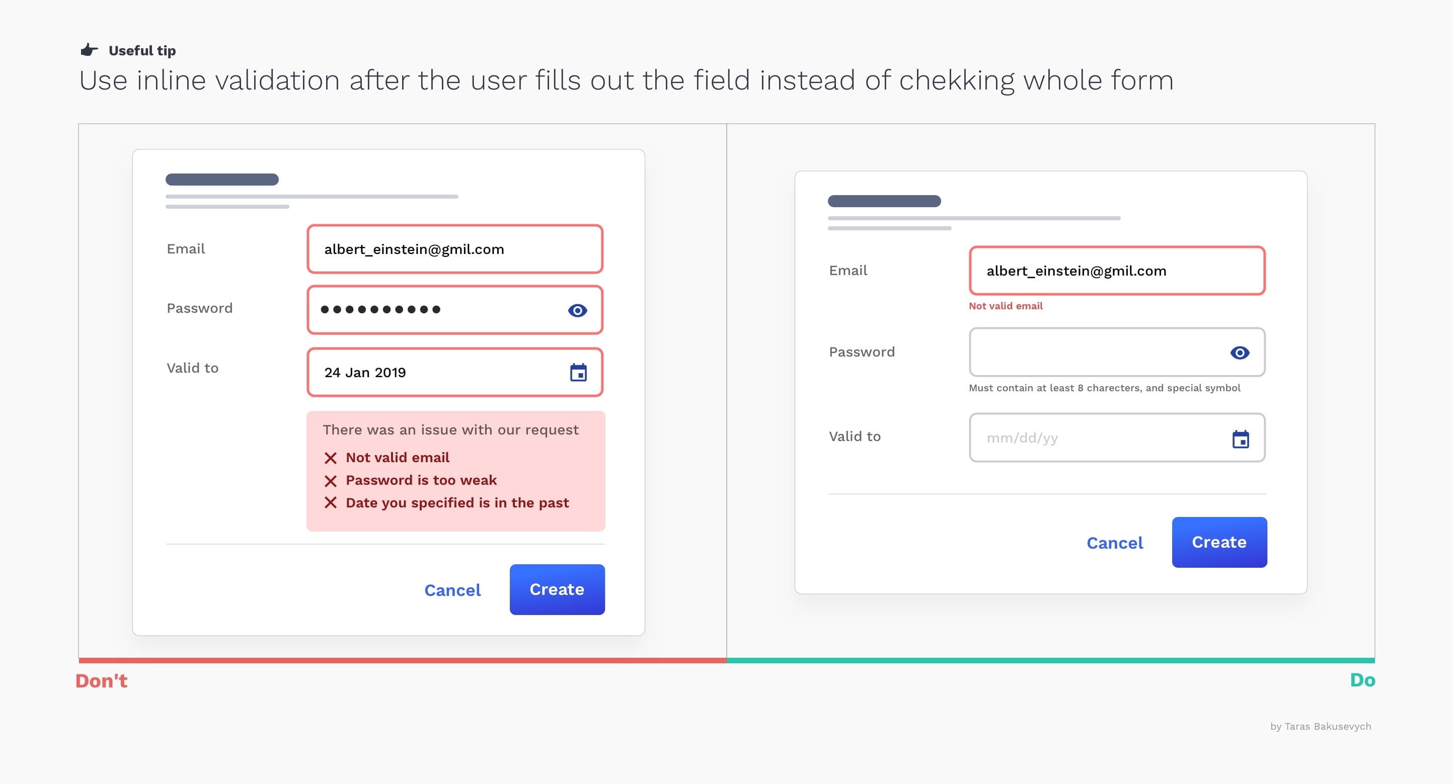
“"Live inline validation" is where the validity of user input is checked live as the user progresses through the form, rather than checking the input at a single point when the user submits the form. Implement it correctly to avoid causing further harm.
- Display validation messages close to the entrance and all together
- Don't yell at the users. , Error messages should tell users how to fix the problem instead of blaming them.
- Avoid” "Premature validation"” when the field is marked as invalid before you finish typing
- Consider using “"positive validation", because it can add a sense of pleasure and progression.
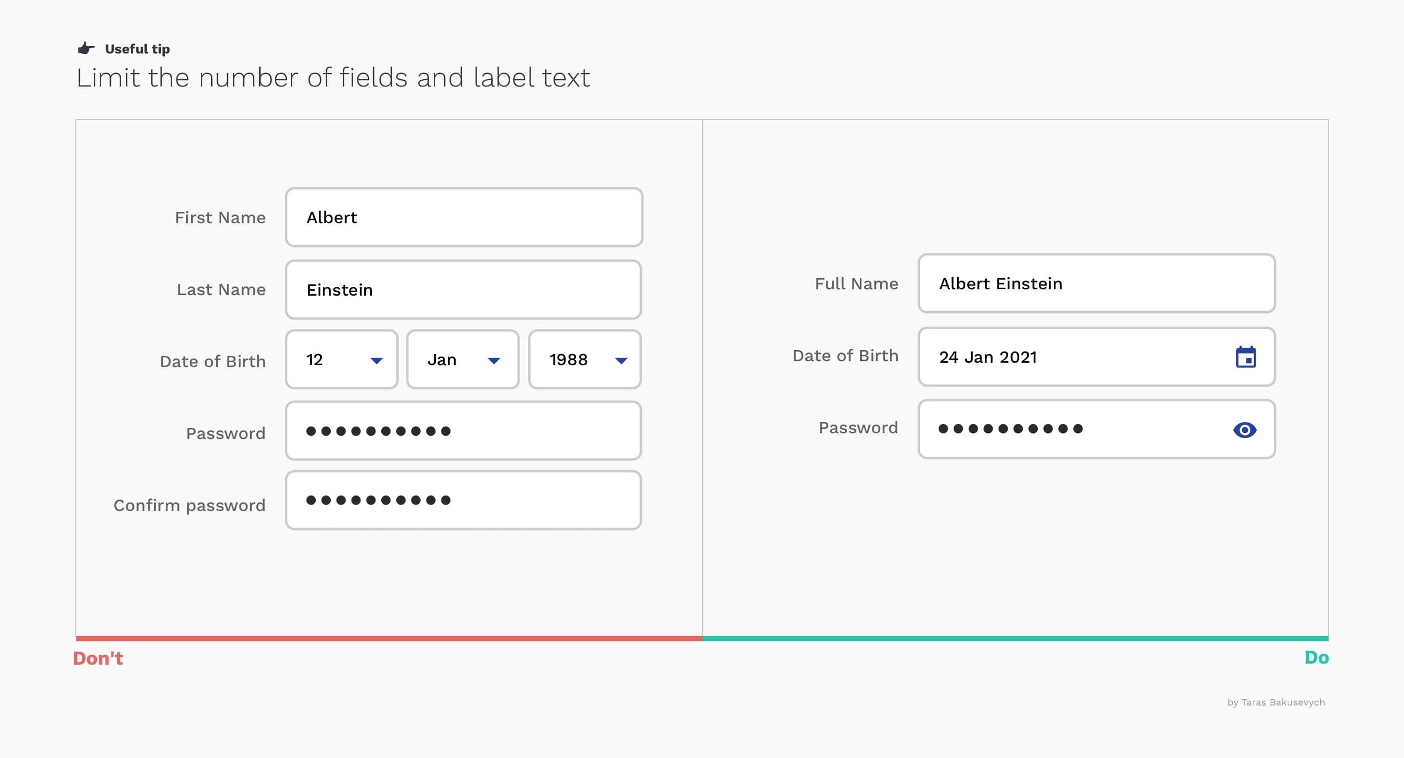
Reduce the number of fields.
This will remove the visual and cognitive load and make it seem much simpler.
- Do not split text such as Full Name and Date into multiple fields.
- Don't ask for the same information multiple times.
- Work with labels and copy tips to reduce it as much as possible.
Hide irrelevant fields
By releasing information progressively, we reveal only the essentials and help users manage complexity only when necessary.
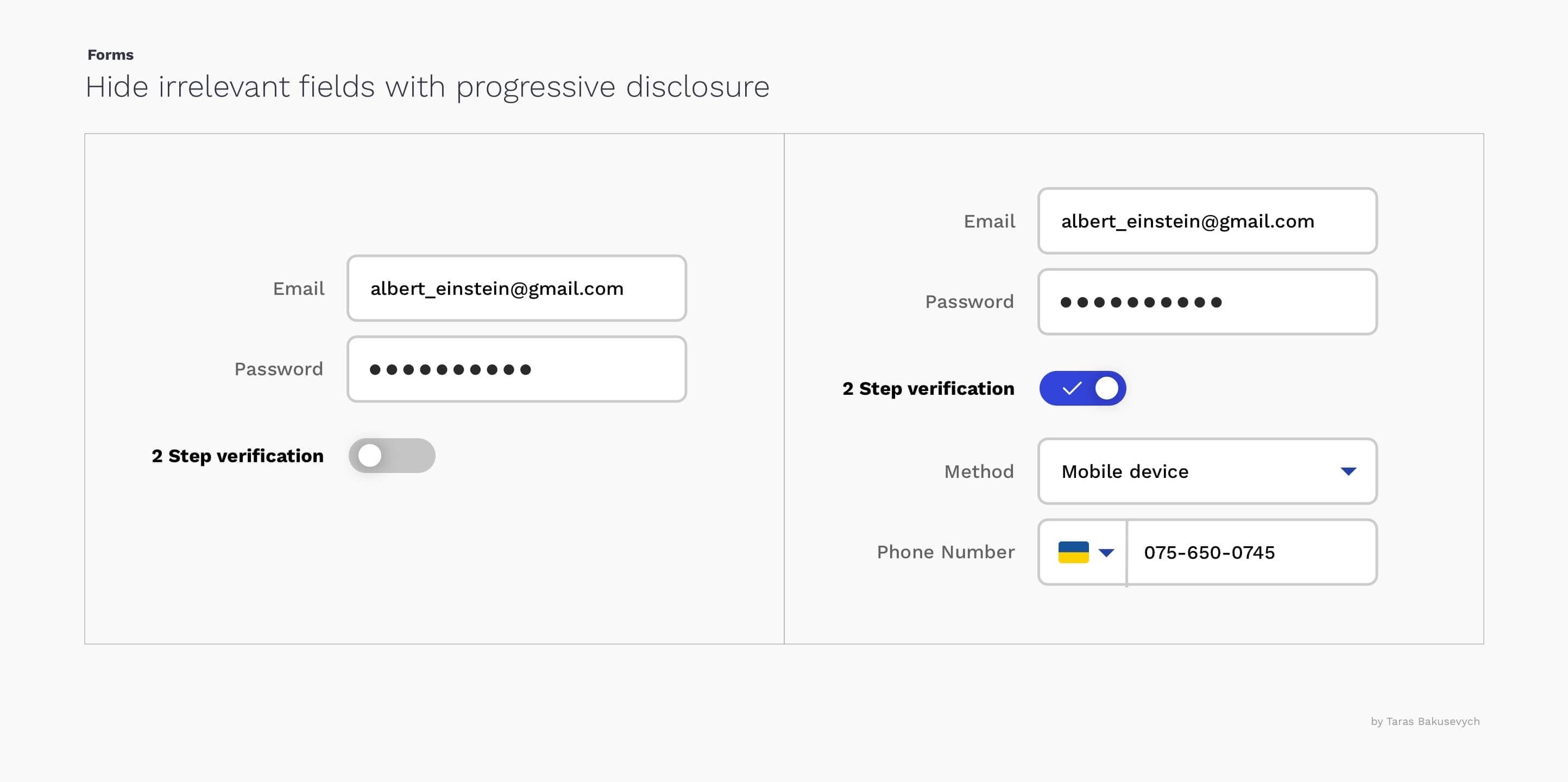
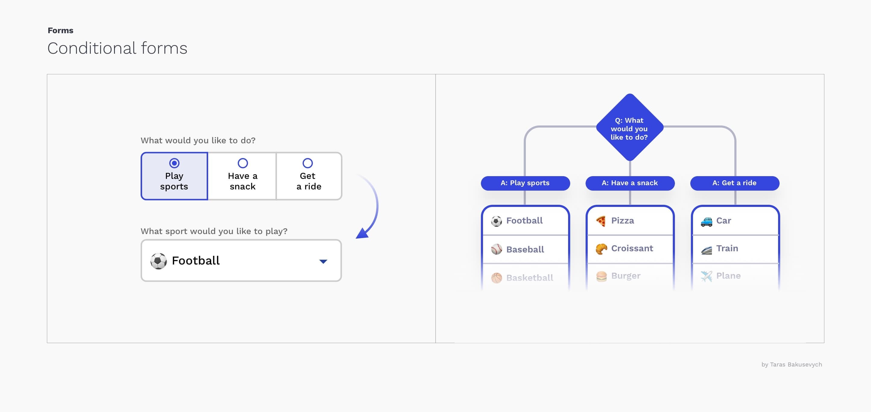
Use conditional logic.
Conditional logic allows you to automatically show or hide fields and skip pages in a form based on visitor responses. This approach will not only reduce the number of fields but also make the form completion process more personalized and conversational.
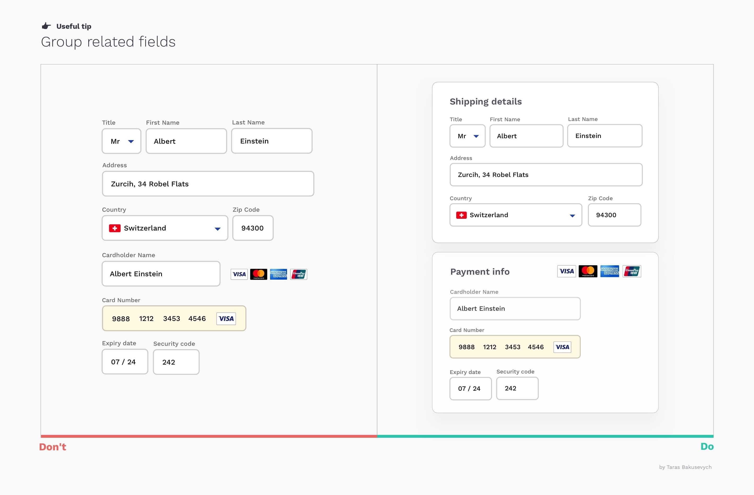
Fields related to the group
One of the easiest ways to simplify complex forms is to start grouping related fields. There are several grouping principles in Gestalt psychology that help items feel related: proximity, similarity, continuity, closure, and connection. Grouping dozens of unstructured fields into a few manageable sets will significantly increase the usability of the form.
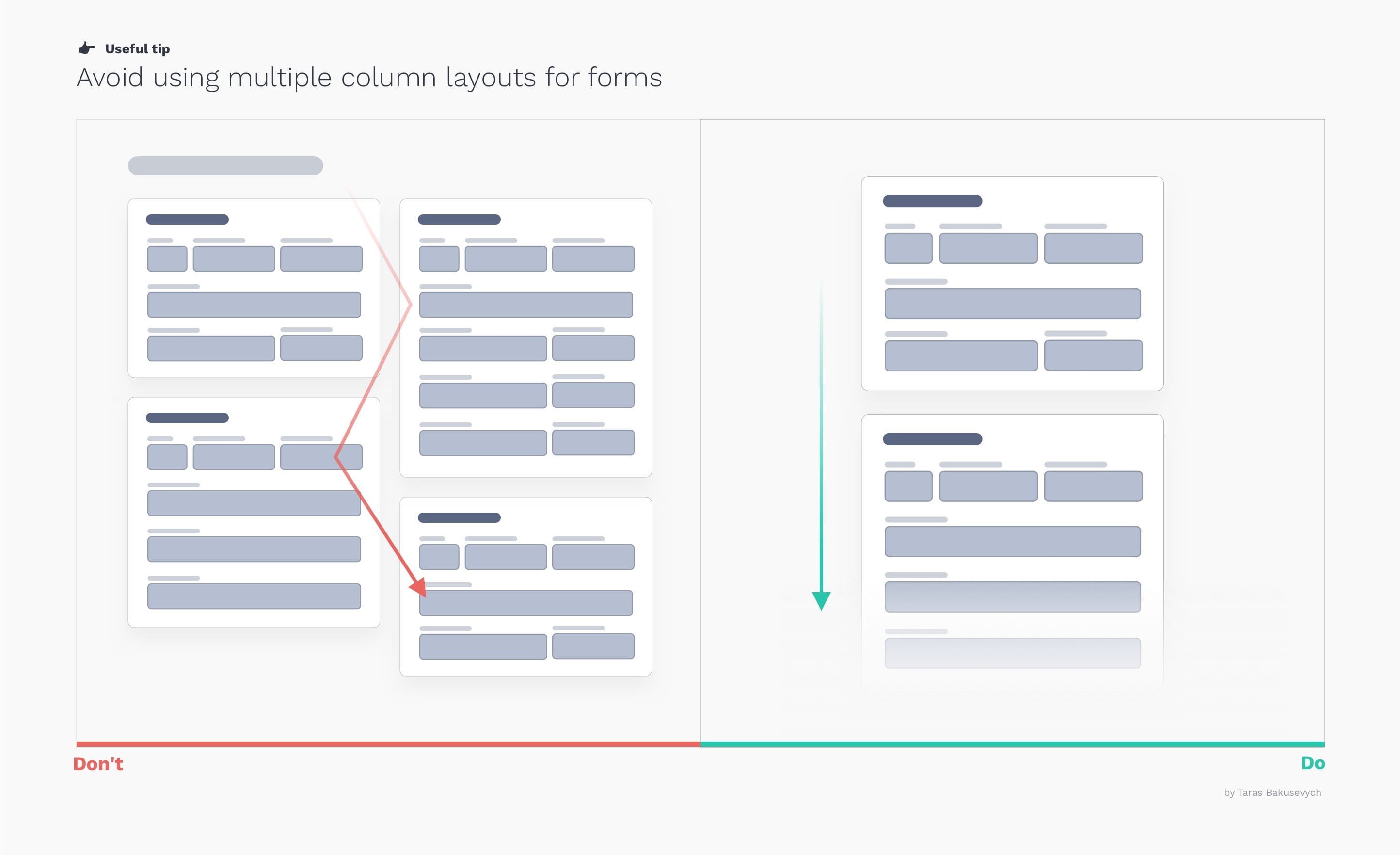
Avoid using multiple column layouts.
A column layout creates a clear path to completion for the user. The consequences of using a multi-column form layout include users skipping fields where they actually have data to enter, entering data in the wrong fields, or simply stopping, which can lead to abandonment.
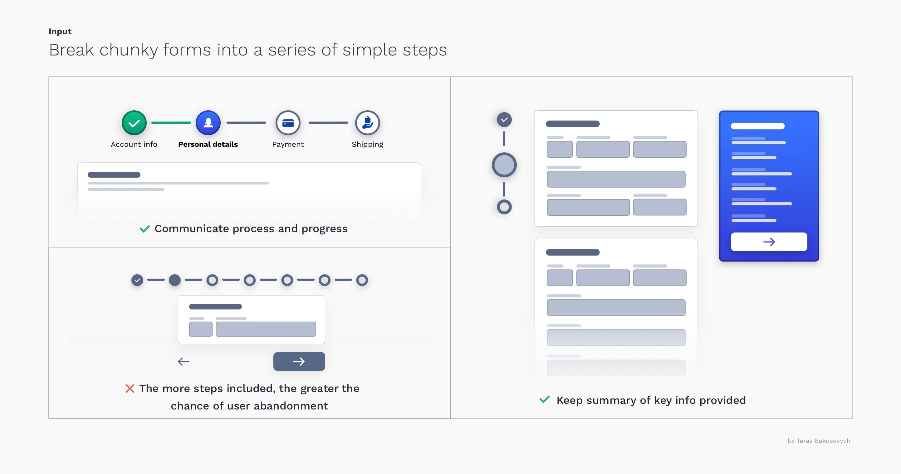
Break down complex forms into a few simple steps.
Sometimes, even after removing everything unnecessary, some forms can become enormous. Breaking down large tasks into a series of smaller ones seems much easier and motivates them to complete the process.
- Display the steps and visually communicate the progress of For the user, this provides more satisfaction and motivates them to keep going.
- Do not granulate the form. , Many steps will not help, they will only irritate users.
- Summarize the main information provided. to reduce anxiety and need to have a review step at the end.
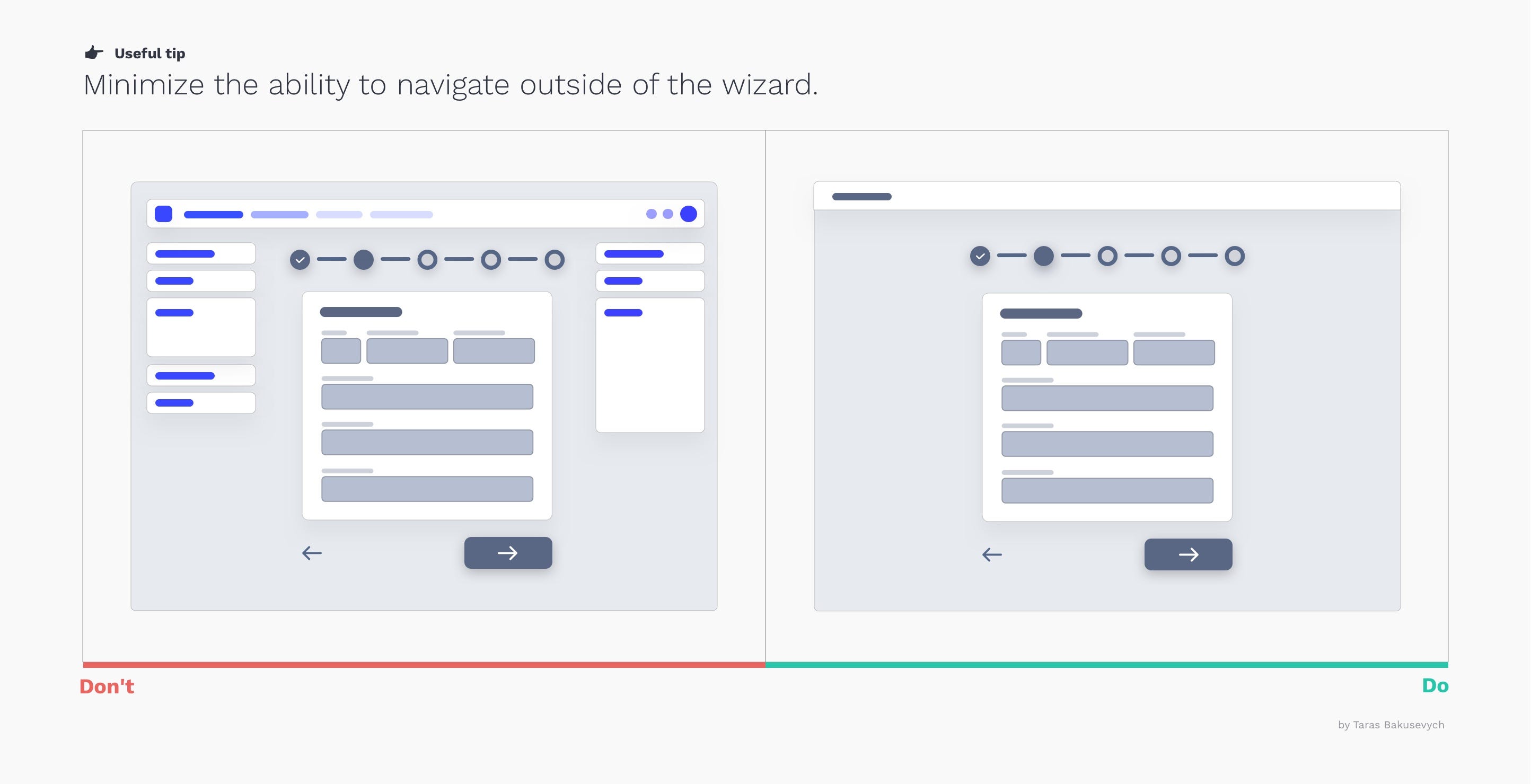
Minimize the ability to navigate outside of the assistant.
If the form is large enough to be divided into multiple steps, it deserves a separate and clearly focused space to work with it. Exposing the general navigation or any link that interrupts the process will only create confusion. I also advise against multi-step forms in small pop-ups.
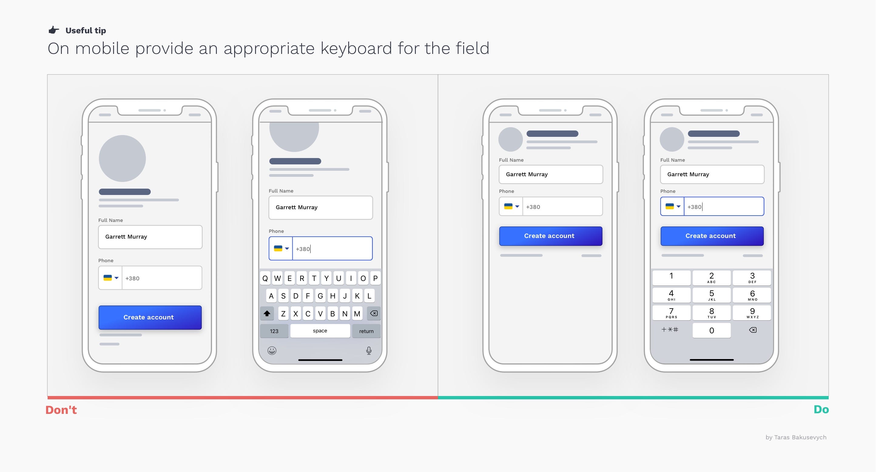
Show the appropriate keyboard type.
Android and iOS provide several different keyboard types, each designed to facilitate a different type of input. To optimize data entry, the keyboard displayed when editing a text field should be appropriate to the type of content in the field. Be mindful of where the keyboard will appear. To avoid unnecessary scrolling, position your text fields in the upper area.
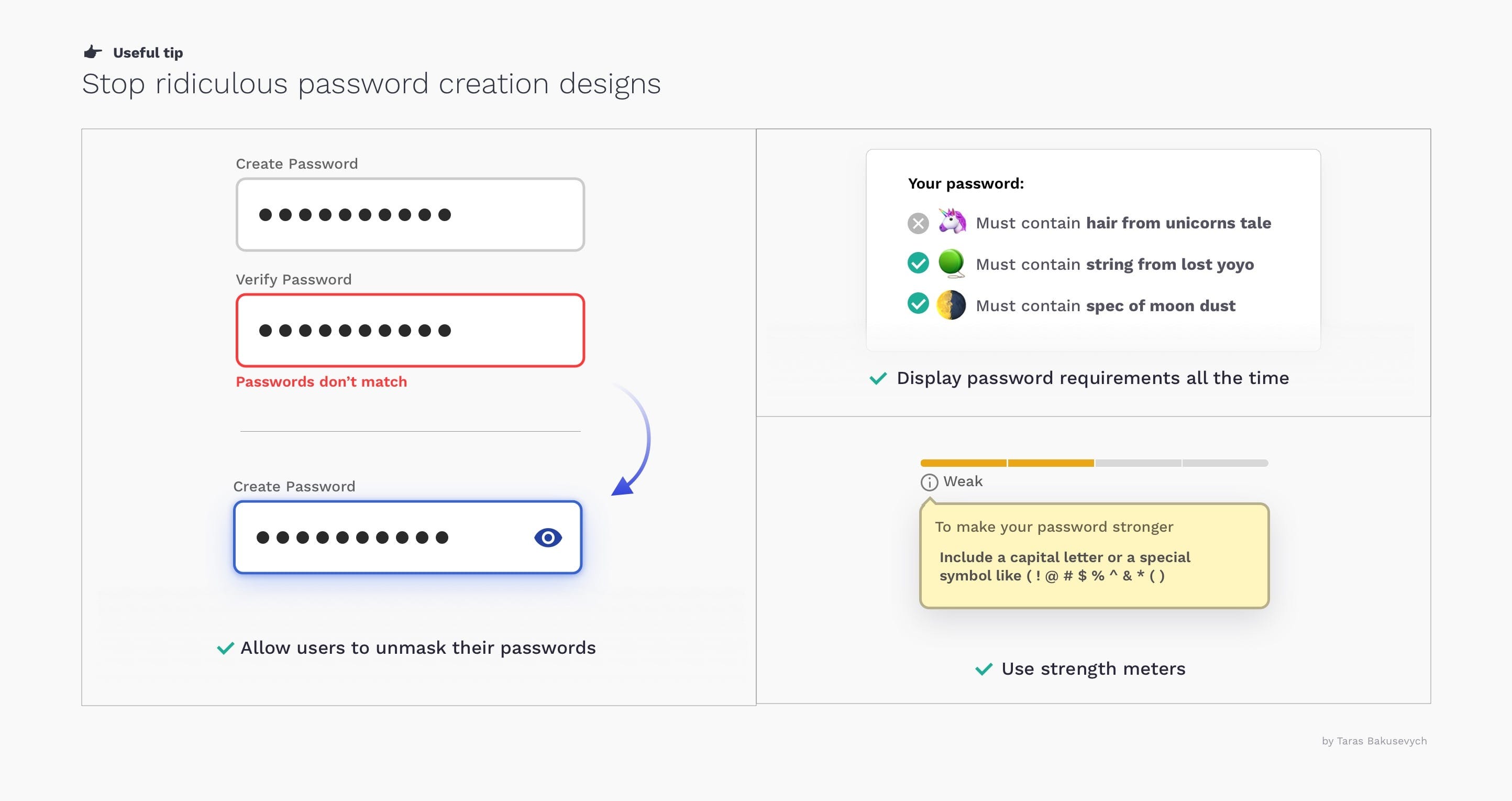
Stop ridiculous password creation projects.
- Allow users unmask your password in Instead of asking you to type it twice. It will also work better for password generation apps.
- Display password requirements Monitor the user's progress at all times and indicate their progress in meeting all the criteria. Try to simplify the requirements for the user.
- Use force meters encouraging users to create stronger passwords