
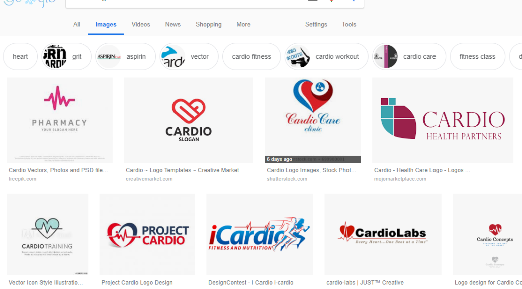
One of the commentators, however, caught my interest.
“Being unique takes effort. Recently, I started a gig – a cardio center was rebranding and I asked if I could come up with a new logo for them. I was brainstorming ideas for two hours. Then I went and searched “cardio logo”. All my ideas were already there…”
Is being unique an effort? Certainly. What kind of effort, however? Is it about the unique inspiration we find somewhere, or is it the unique way we perceive that inspiration?
It's getting harder to find unique inspiration. We have boards from Pinterest, images from Google, and featurettes from Dribbble, but they all show practically the same things. It's no wonder that our work can get lost in an ocean of similarity.
And how do we look at these things? There are trends that affect us – we know what works “nowadays” and what doesn’t. This drastically hinders our ability to produce unique work.
And yet, some designers manage to do it. Among thousands of others, their work stands out. Meanwhile, their images reach the top of the leaderboards and gain a lot of attention.
I interviewed several of these designers whose photos I found on the front page of Dribbble and asked them a simple question:
How do you keep your designs unique when so many people are influenced by the same visual trends, repetitive images on Pinterest, and actions, or simply copy each other?
Here's what they told me.
Jonathan Schubert , Designer and Illustrator
Jonathan: “Some of the base typefaces in use, like Devinne, are authentic to the period – 19th-century apothecary labels, medicinal advertisements, alcohol, etc. The main typeface, however, was completely custom-made and achieved through a lot of fumbling around until something spoke to what I was generally envisioning. I wanted the logo to match the natural aesthetic of the plant illustrations to come (no hard edges). The logo(s) needed to feel robust as well – the desert of the northeastern US/Canada, in general, is somewhat of a backdrop for the brand I was envisioning. I kept imagining the brand coming from Montreal, circa 1900 – so the slight extravagance and character of the main logo has a French lithographic poster feel, in my opinion. Conversely, the humble typefaces and natural edges give it a borderland utility that, to me, Dribbble
Whenever I'm starting a new project, there's always a balance between drawing inspiration from what's currently being explored in the world of design/art/branding and, in response to that, finding my own relevant contribution, amendment, or even complete rejection to arrive at something entirely my own. It's a constant balancing act between what I personally enjoy exploring and think is interesting, new, or right at the time (also known as comfort zones), and the need to seek out the necessary discomfort that always leads me into new territory.
It's a constant balancing act between what I personally enjoy exploring and find interesting, and the need to seek out the necessary discomfort that always leads me to new territory.
In practical terms, the formula above means looking at other work that inspires me – all the time. It's part of what you have to do these days to keep up with what's happening in the world of design and branding. This inspiration will serve as a reference for what to do – or – what not to do. In the latter case, it's usually a project that has a well-traveled aesthetic or vibe that has become very familiar to us. In the former case, it's about understanding where others have contributed wonderfully to what I consider the best (fill in the blank): this could be typography, concept, overall branding, etc., and simply taking note of it. .
Inspiration will serve as a reference for what to do – or – what not to do, for example, a project that has a very well-traveled aesthetic or vibe that has become too familiar to us.
I also find it extremely important to delve deep into additional material, references, and research to inspire each project. It's about immersing myself in the world of any brand I might be developing – finding the subtle narratives that inform any brand and build entire worlds around them. The more I know about the world from which my inspiration derives, the more original and inspired my solutions will be. Essentially, this is the difference between just Looking at other design work for inspiration and then setting that aside to find inspiration elsewhere. Again, a balancing act. Personally, I think the best inspiration comes from this latter category because it's always the most honest, raw, and adventurous in terms of where it can lead.
It's about immersing myself in the world of whatever brand I'm developing. The more I know about the world from which my inspiration comes, the more original and inspired my solutions will be.
Finally, it's important to me. love The process, the routine. For example – I love exploring the juxtaposition of typefaces and how they perform to tell a story at a glance.
Jonathan: “This project found inspiration in a classic apothecary aesthetic. The name alone communicates that message. The client requested a strong typography and a strong monogram for the “A”. I looked for pharmacy/pharmacy labels and printed materials as I knew they would have a refined utility that I could draw inspiration from. The “A” monogram really came last because I had to sketch it so many times to get the graphic balance and gestalt right.” Dribbble
For me, it's a universe of possibilities – the same feeling you get when you look at a Pantone book. At the end of the day, it's not how I feel when a project is wrapped up and the brand suite is organized and beautiful. It's about that moment when I get into every project; when I've been right for 3 hours or 3 days and something clicks and I officially shift from a blurry vision in my subconscious to exactly where I wanted things to end up all along. It's the "high" of the process.
It's important for me to love routine. It's about that moment when I started a project for 3 hours or 3 days and something clicked and I officially shifted from a blurry vision in my subconscious to exactly where I wanted things to end up.
The more excited I am about what I'm looking for, the more original the final results will be.
Anna Hurley , illustrator
Technically, I learned a lot through imitation. And it's easy to just stop there. But my illustrations are composed of who I am and how I see the world, and I tend to be heavily influenced by the many different and wonderful things I consume, such as movies, books, art, video games, graphic novels, music—the list goes on and on.
Anna: “I think the prompt was just to draw a yeti piloting a plane. The character was already established, so I really liked the idea of putting it in an old toy drawing with a little scarf flying to indicate movement.” Dribbble
I try to take as much as I can and interpret them through my work. It's not a completely conscious action. I know this is a vague answer, but I just try to make my work something I enjoy, am proud of, and feel like myself.
My illustrations are composed of who I am and how I see the world, and I tend to be heavily influenced by the many different and wonderful things I consume, such as movies, books, art, video games, graphic novels, music, the list goes on.
I didn't consciously try to do something unique. Since then, so many things have been done, and there are so many similarities without my knowledge, there's no way I can truly do something unique. All I can do is try to be honest with myself and hope that uniqueness comes out in my work.
Anna: “I was just wanting to relax and read, and then I drew this. And I liked the idea of playing with horizon lines and high-contrast colors; it was just a fun study.” Dribbble
I didn't consciously try to do something unique. Since then, many things have been done and there are many similarities without my knowledge, […] All I can do is try to be true to myself and hope that uniqueness comes out in my work.
Manuel Cetina , illustrator
Manuel: “I made this illustration for a Hardcore and Noise tour poster. And the “stab keyboard” looks cool for the poster tour. A friend told me about the band at a vinyl party.” Dribbble
The internet is an incredible tool and the information can be amazing, but I love buying old books and comics for inspiration. I love studying the design and techniques, the compositions of old comics, the ink in the graphics, the halftones used in the shadows, and the color of the keys, especially those with few colors.
Manuel: “There’s no hidden message in the illustration. I drew a banana because it was the anniversary of a Sticker Party, “Sticker x Sticker.” I think it’s funny to use a banana and not a cake – it’s the same feeling as when you peel a banana and you “peel” a sticker, which you recognize when you pick up the plastic from the back.” Dribbble
I think that old-school and analog methods are good sources of inspiration for the digital age.
I love buying old books and comics for inspiration. I love studying the design and technique, the compositions in old comics, the ink in the graphics, the mid-tones used in the shadows…
Jack Kirby, "2001: A Space Odyssey".
I love Daniel Gillespie Clowes' work in Bernie Wrightson's "Ghost World," by Moebius.,
Gustave Dore in “The divine comedy” and Jack Kirby in “2001 A Space Odyssey Comic”.
Martha Bergmann , Product Designer
Martha: “This animation is a good example of creating a variation on something and interpreting it with a new twist. I was inspired by this Dribbble post by Hoang Nguyen , And I thought how cool it would be to recreate that transition in Studio and then be able to interact with it!” Dribbble
I wouldn't say I'm always 100% exclusive with my designs, but that's just part of being a designer. Every day we're absorbing new experiences, as users when using our digital devices and then as observers when entering online design communities that share digital explorations. Naturally, we're going to incorporate bits and pieces of what we absorb into our own projects, which means trends are likely to trickle down into them.
Take several trends and flip them on their heads, or view them from a new angle. That's how you become more original as a designer.
There's something to be said for keeping up with the trend in your designs, as you want your user interface to feel current and relatable to your users. But the absolute key here, which is what we designers should do to challenge ourselves, is not to worry about creating something 100% modern, or 100% unique, but perhaps 50% unique.
One way to create unique designs is to combine elements and parts from various other designs. What you create from these ideas is a variation on how you imagine the pieces and parts of the designs working together. We can learn a lot from each other as designers. It can be about interpreting other designs with our own point of view or style.
I look for inspiration in the physical design of products and packaging design. My mother is a watercolor artist, so I also find inspiration in examples of fine art. Sometimes it's as simple as drawing on a color palette and trying to incorporate that into a design.
We should draw inspiration from multiple sources, or even different media, such as architecture, and merge them into a new exploration. I use architecture as an example, since it is quite different from digital design.
Martha: “One of my colleagues at InVision, Daniel Noskin , Pablo Stanley explained how he created a "sticky" shape in InVision Studio. He tweeted about his variation. here .I made a update animation "It started with the same principle, and then I expanded it even further and made the animation above, which explores how a Brazilian Air Force can be fun."” Dribbble
I look for inspiration in the physical design of products and packaging design. My mother is a watercolor artist, so I also find inspiration in examples of fine art. Sometimes it's as simple as drawing on a color palette and trying to incorporate that into a design.
There are all sorts of different mediums when you start observing what's around you.
Take several trends and invert them, or visualize them from a new angle. That's how you become more original as a designer.
Brett Stenson , art director and illustrator
Brett: “This tiger was based on my love for connecting angles in a composition and channeling the rigid aesthetic of a sculpted wooden figure. It is chasing a butterfly to show that it is a young tiger cub, curious about its new world.” Dribbble
I would start by saying that uniqueness is based on each person's design vision and their reasoning for making art in general. My work is mainly influenced by the music, environment, and personal worldview I experience. Much of what inspires me seems like a caveman, or music from the depths of the jungle… places I feel like I've just traveled to in my mind. Of course, design can be ultra-modern and people tend to inspire each other – but I shamelessly did that for a long time too! I used to draw like Ed Roth for a while, but I didn't like it anymore, so I changed my focus.
My work is primarily influenced by the music, environment, and personal worldview I experience. Much of what inspires me seems like something from a caveman, or music from deep within the jungle… places I feel like I’ve just traveled to in my mind.
Many people are inspired by the Land Boys right now (I am too, those guys are incredibly creative and great at telling a story with most of the pages ripped out), but I personally think that's fine. Someone will get inspired and build something completely different with what they've learned. Not to mention, many clients see these things and ask designers to do a certain style, which can be annoying. But sometimes that's part of our job.
Many clients see certain things and ask designers to create a specific style, which can be annoying. But sometimes that's part of our job.
Along with all of that, I just try to listen to myself and what I want to say. My goal is to make vibrant, fun, primitive, and iconic work, but mostly, I need to enjoy myself while I'm doing it. My inspiration comes from many other incredible designers and artists, both past and present, and I think I'm not ashamed of that. I look at things people do and try to appreciate their process or their approach to composition, colors, whatever!
Brett: “This illustration is a tribute to The Body, a band known for their haunting themes of desolation, isolation, and dissonant distortion. In the drawing, there’s a plague doctor galloping on a dead horse, which seemed like the right symbolism for an album that sounds like a medieval village burning to the ground.” Dribbble
From there, I just digest it and try to put it through my own lens. Inspiration and homage are beautiful things when there are good intentions.
My inspiration comes from many other incredible designers and artists, both past and present, and I think I'm not ashamed of that. […] Inspiration and homage are beautiful things when there are good intentions.
Postscript
It seems like everyone puts in a unique effort to be, well… unique. It has to do with the source of inspiration and how designers use it.
Someone might draw inspiration from old books and comics, tribal music, and packaging design. However, it's something that people genuinely enjoy that ultimately finds its way in and resonates with them.
As for how designers use inspiration, that also varies. Some are directly inspired by the work of their fellow artists, while others indirectly channel that insight into their work, trying to convey a certain feeling rather than a style.
It's becoming increasingly complex to remain unique these days. And you can't stay that way for long, because he or she will always inspire a cohort of followers. However, there is one thing in common among all the designers I interviewed. I noticed that they all allow a little bit of themselves into their work.
No matter the competition, it's always possible to stay true to yourself and your worldview, even while using the latest trends and tools. I hope others feel this way.


