

The Curse of the Cursor
I had no idea that the Alan Kay himself It was responsible for the characteristic shape of the mouse cursor. In 2020, James Hill-Khurana sent him an email. and received this response:
The appearance of Parc's mouse cursor was (actually, by me) because, on a 16×16 pixel one-bit grid (which is what Parc's Alto used for the cursor), it results in an interesting arrowhead if one side of the arrow is vertical and the other is slanted (among other things, I designed and created many of the initial bitmap fonts).
Then the idea caught on, as happens with so many things in the field of computing.
And wow, that really caught on!
But let's go back in time a little. The first mouse cursor during the historical demonstration Doug Engelbart's 1968 design was an arrow pointing directly upwards, the obvious symmetrical choice:
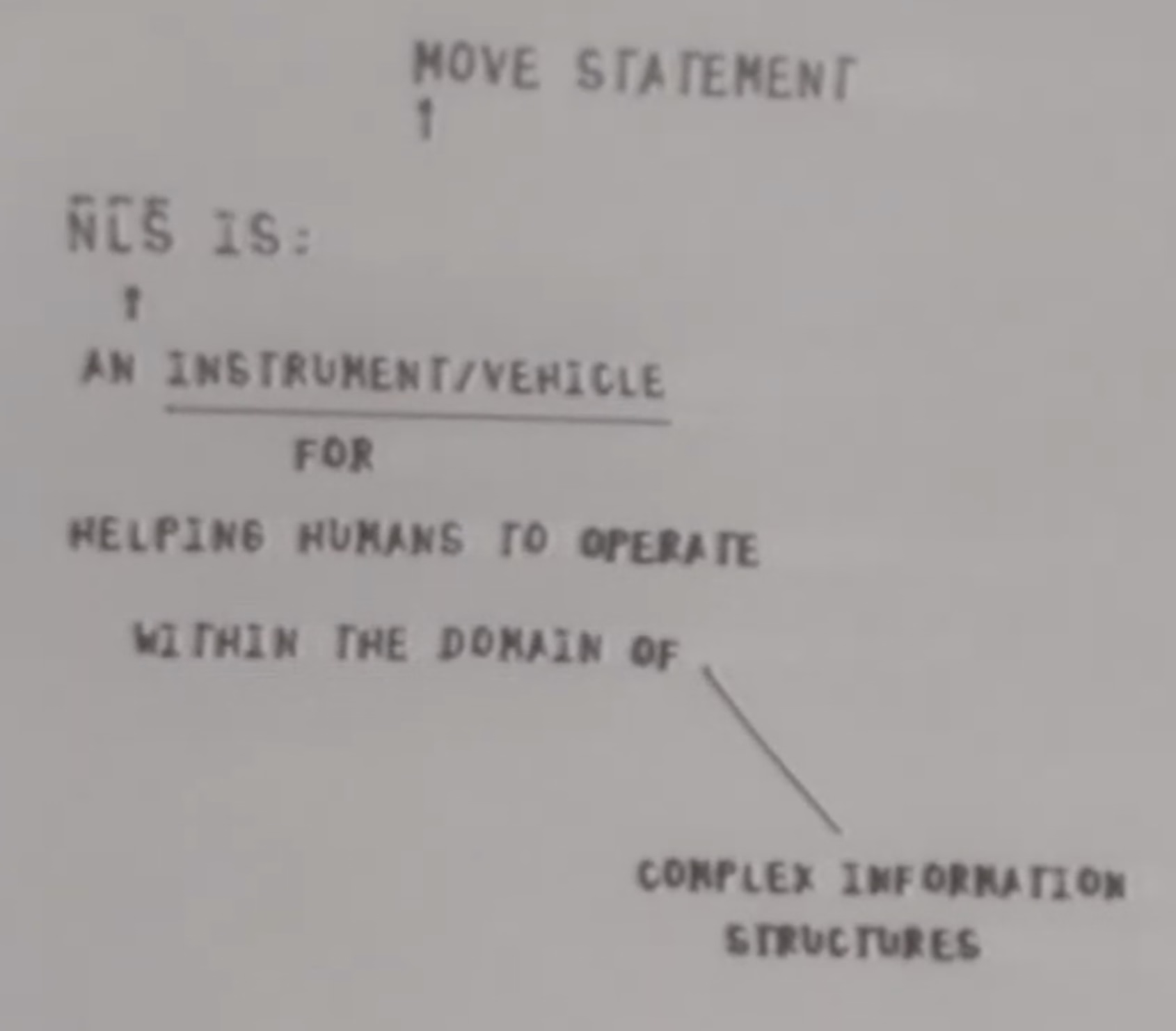
(It's possible to see two of them because Engelbart not only invented a mouse – he also thought about some subsequent steps, including collaboration between several people using mice.)
But Kay's argument was that, on a pixelated screen, it's impossible to do justice to that shape, since both arrowhead angles will be uneven and imprecise. (A second, unmentioned argument is that the arrowhead needs to be a single, sharp pixel, but this makes designing a matching tail for the cursor difficult, as it limits the options to 1, 3, or 5 pixels, and the desired number is likely 2.)
Kay's solution was to straighten the left edge instead of the tail, and this format was adopted by Xerox Alto in the 1970s.
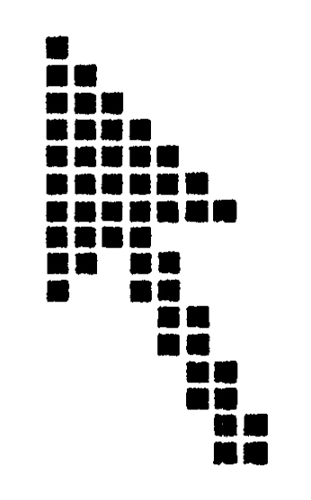
Interestingly, the upward-facing cursor returned as one of the variants in the Xerox Star, the commercially released version of the Alto in 1981…
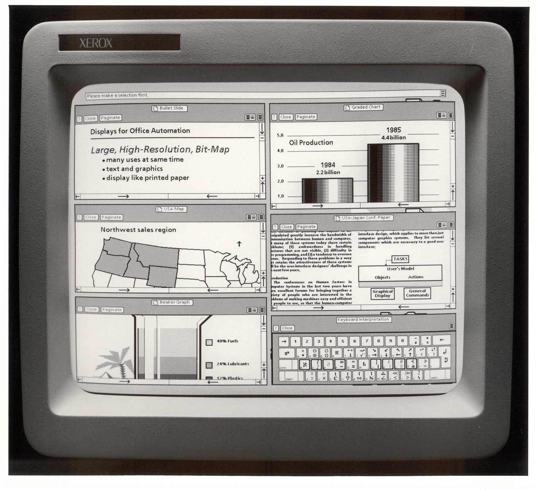
…but the Star failed, and Apple's Lisa in 1983 and Macintosh in 1984 followed in Alto's footsteps. Then, Windows 1.0 Since 1985, it has adopted a similar format – only with inverted colors – and the cursor has had the same appearance ever since.
This doesn't mean there haven't been innovations since then (cursor trails were useful on slow LCD screens in the 1990s, and the shake-to-locate feature, added by Apple in 2015), or the more recent battles with the hand-shaped mouse pointer, popularized by the web.
But the only substantial attempt to redesign the mouse pointer that I'm aware of came from Apple in 2020, during the introduction of the trackpad and mouse use on the iPad. The mouse pointer a) became a circle, b) transformed into other shapes, and c) occasionally transformed into the very objects over which the cursor was positioned.
The 40-minute video provides a detailed analysis. Today, it's a fascinating artifact. On one hand, it's truly exciting to see someone venturing into something that has existed for so long. The evolution of some of the physics principles initially tested in the Apple TV interface seems clever, and the new mechanisms of inertia and magnetism are interesting to analyze.
But the high production value and Apple's detached style rob the video of some of its authenticity. This is "Design with a capital D," and one should always maintain a certain skepticism towards such well-produced design videos and the inherent propensity for... falsehood which accompanies this segment. Without considering the budget, the arguments don't fully hold up (why wouldn't the same principles that make the text cursor adjust vertically extend to its horizontal movement?), and the question arises as to what was implied (wouldn't the cursor transitions be a distraction and slow down the user?).
However, I speak with the enormous advantage of hindsight. In truth, using that version of the mouse cursor on my iPad didn't feel like the revolution it suggested, and barely resembled an evolution. (Seeing the tilting buttons on the Apple TV for the first time was far more fascinating.) And, in any case, Apple ended up undoing several of the changes five years later. The cursor reverted to a familiar, Alan Kay-style shape…
…and lost its most advanced shapeshifting abilities:
To attend to the WWDC 2025 video that mentions the change (The relevant parts begin at 8:40) is another interesting exercise:
2020:
We considered simply bringing in the traditional arrow pointer from the Mac, but that didn't seem ideal on iPadOS. […] There's an inconsistency between the pointer's precision and the precision required by the application. So, while people generally think of the pointer as offering greater precision compared to touch, in this case, it's helpful to reduce the pointer's precision to match the user interface.
2025:
Everything on the iPad was designed for touch. That's why the original cursor was circular, to closely resemble your finger in size and precision. But internally, the cursor is capable of being much more precise than your finger. So, in iPadOS 26, the cursor gained a new shape, unlocking its full potential. The new cursor feels more precise and responsive because it always follows your touch exactly, one by one.
(That "somehow" in the second video is an interesting slip-up.)
I hope this doesn't sound like a mockery of the presenters, or even of the, in my view, exaggerated approach of 2020. We try new things, sometimes they don't work, and we go back to what worked before.
I just wish Apple would be a little more transparent; there are limits to the "we've always been at war with Eurasia" PR approach they use at times like these, and I'd really like to know what happened: Did people hate the circular cursor? Was it difficult for app developers to adopt it? Was it just a random consequence of the Liquid Glass visual style, or perhaps the person who championed it the most simply left Apple? We could all learn from this.
But what interests me most is the resilience of the angled mouse cursor shape. In a post-retina world, one would expect a sharp edge at any angle, and yet we are left with Kay's original design – refined, no doubt, but still sporting its somewhat awkward asymmetry.
The always excellent Posy addressed this issue. in the first 7 minutes of your YouTube video :

But one comment in particular on that video caught my attention:
Honestly, I had never thought of the mouse cursor as an arrow, but rather as its own shape. I was impressed when I realized it was just an arrow all along.
…because maybe that really is the answer. Maybe the mouse pointer followed the same path. that the floppy disk icon , transcending its origins. It's no longer an arrow. It is the shape of the mouse pointer , And it always will be.


